
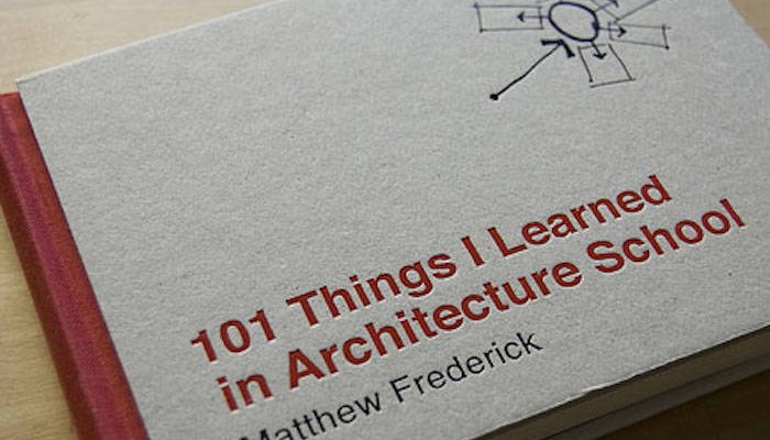
Although this book is aimed at architecture students, I felt it was actually quite helpful in thinking about space, architecture and the creative process while designing scenery for some of my animations.
It has helpful tips on how to think and create through sketching, but also slightly more meta subjects such as what makes space exciting or compelling to look at. What makes it dramatic, how do you frame your views?
Each spread is a single idea, technique or concept. Great illustrations and wise words throughout. I really love the board cover and binding. Another nice touch is the numbering and the use of the blackened center gutter.
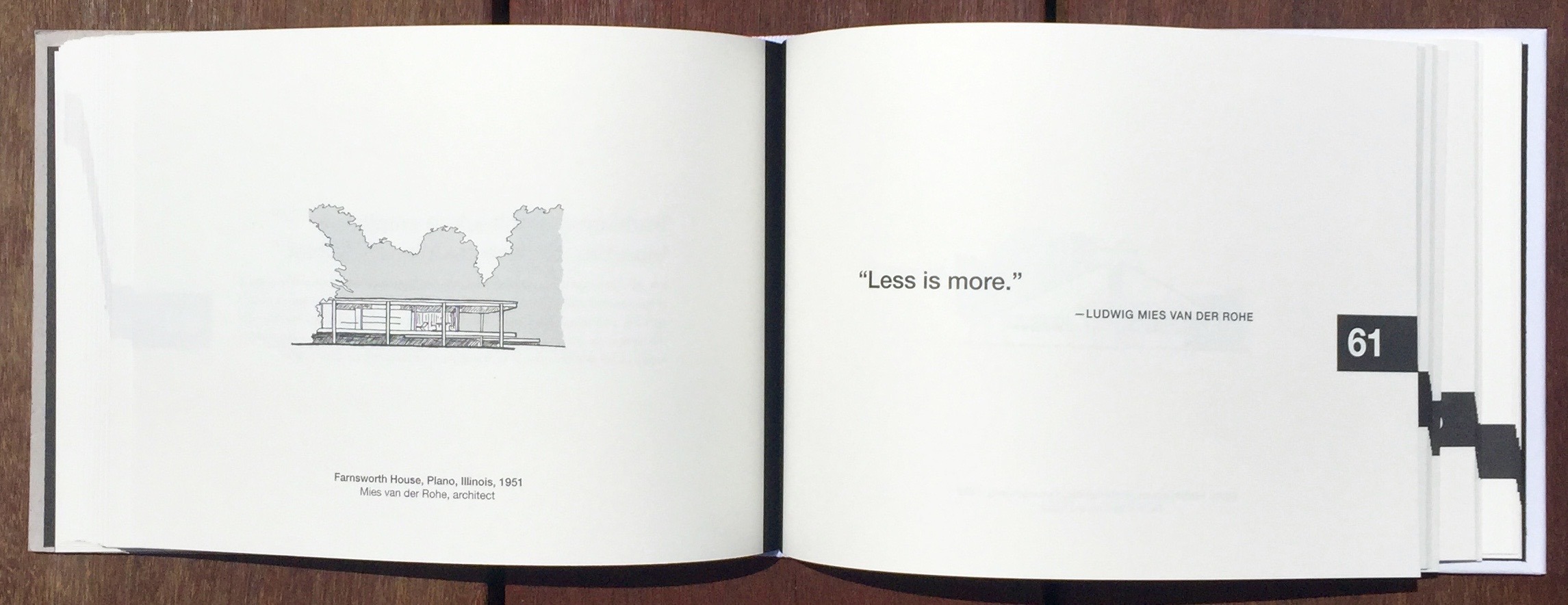
The book is small enough to keep on your desk, and that’s exactly where it belongs. Every spread is one lesson: a short text on the left and a drawing on the right. You can read it front to back in an evening, but it works better if you just open it at a random page when you’re stuck.
Some lessons are very practical, like how to draw a line or why windows look dark from the outside during the day. Others are more about how you look at a space, like the idea of figure and ground: the empty space around a shape matters as much as the shape itself.


The author, Matthew Frederick, is an architect and teacher, and you can tell. He explains things like someone who has said them to a lot of students, without ever sounding like a textbook.
Because I am not an architect, this gave me a fresh perspective on designing buildings or spaces or simply sketching out a scene.
Why an animator should read an architecture book
In our work we build small worlds. They only have to make sense within the animation, but they do have to make sense. A space needs its own logic to carry a story, and to support the move from one scene to the next.
This book helps you think about that: how to lay out a floor plan, or how to group buildings so the arrangement feels right. One lesson I keep coming back to is about positive and negative space. We tend to linger in positive space, and we move through negative space. That matters a lot when you design a city in 3D. You want a cohesion that makes sense, even if the viewer never notices it.
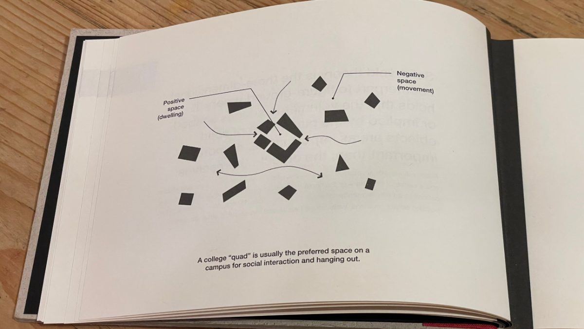
It helps at the most basic level of storyboarding. It helps just as much in urban scenes, where the background filler has to hold together too. How do the buildings relate to each other?
Who it’s for
Anyone who builds scenes or directs, in 2D or 3D. It works for beginners and for experienced animators, because these ideas are rarely taught in animation school. Yet they help enormously when you think about the mise-en-scène of an animation.
More in the series
This was the first book in the 101 Things I Learned series, which now covers everything from film school to engineering, all in the same small format. I also own 101 Things I Learned in Business School. If you design cities and streets, 101 Things I Learned in Urban Design School by Matthew Frederick and Vikas Mehta is the natural next step.
Updated October 19, 2026: added how I use the book in my animation work.
Related: for more on design, shape and space from an animation point of view, see my review of The Noble Approach.

Get the book
101 Things I Learned in Architecture School
Matthew Frederick · MIT Press
Small lessons on space, drawing and design, useful for anyone who draws backgrounds or layouts.
Buy on AmazonBuy on bol.comBuy on Bookshop.org UK
Some links may be affiliate links. How that works.
Leave a Reply